Everyone Loves
Marine world
I placed 2nd in the Ubisoft Toronto NEXT Level Design Competition 2026. This project is a re-imagining of Marineland as a compact stealth map with recognizable landmarks, clear routes, and many small decisions that the player can strategize and act on as they outsmart enemies.
Role: Level Designer
Project length: Sep 8, 2025 - Feb 11, 2026
Tools: Unreal Engine, Illustrator, Blueprints
Game: Ubisoft Toronto NEXT Competition - Level Design
Placement: 2nd Place Finalist
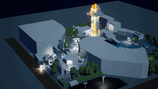
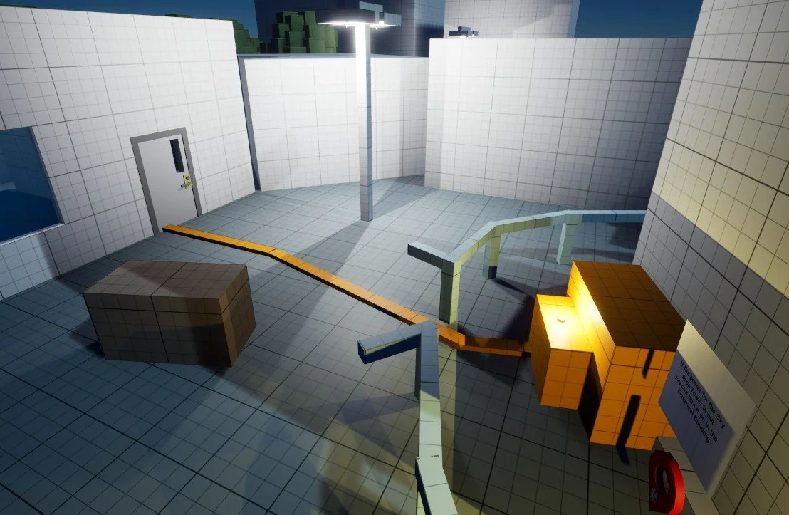
Aquarium final area showdown
What I wanted to achieve with the level
I wanted to build a stealth level where players observe, strategically build a plan, then act on it, even if that plan changes mid-run.
Design intentions
Support multiple playstyles and paths
Keep the map feeling realistic, linear, and readable, with clear landmarks and quick decision loops
Deliver memorable traversal payoff using the Sky Drop tower as a set piece
How I wanted to achieve it
I built the level around “choice moments” and made sure each beat had at least two valid answers.
My approach
Bake options into the main beats (front gate, theatre, aquarium), so routes are not “bonus paths”, they are real solutions
Use readability tools to guide players without UI hand-holding (leading lines, cables, sightline breaks, hard locks)
Teach a new mechanic in a safe space, then re-use it later under pressure (Dry Ice fog)
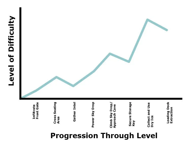
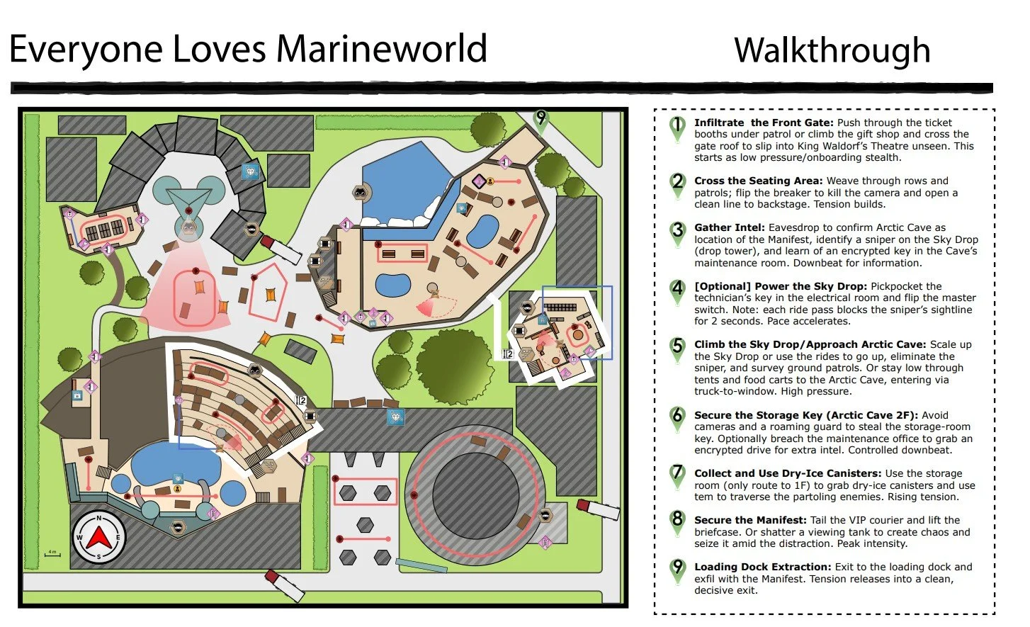
Flow Chart of Beats
design Constraints
While initially, these constraints revealed in phase 2 made me alter large sections of the level, these rules actually helped the mission become sharper and more intentional.
The challenge required a linear stealth action-adventure level with traversal challenges, light hostile presence, and a required lock-and-key
Phase 2 limits forced smarter layout choices: 12 AI cap and a condensed play space
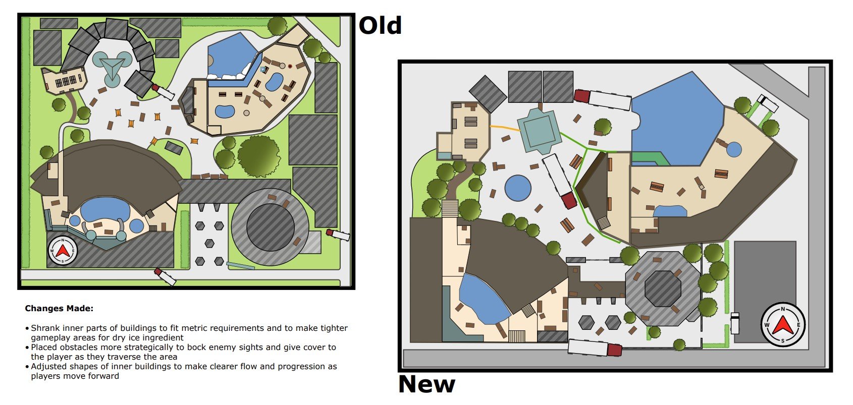
Page from the phase 2 change list, showcasing the map changes as I scaled the level down by half the original size
Process
Phase 1: Mission Design Document
I started by reading the instructions for constraints and “must-haves” (lock-and-key, traversal, multiple solutions), then brainstormed grounded real-world locations. Marineland clicked because it naturally gives you big landmarks, and I had a personal connection to it, growing up reading many whale books and attending Marineland.
I learned Illustrator during the competition, and found that tracing patrol loops with my finger on the screen helped me find routes that were both readable and interesting while also helping me plan obstacles and barriers.
Midpoint check-in
They gave me the Unreal project, and I started to block out the level as I turn this from 2D to 3D. I used the check-in to validate three things: whether the theatre stands were readable and open, if the fountain and pathing helped guide players in the outside area, and if the elevator could be used clearly to convey the sky drop ride.
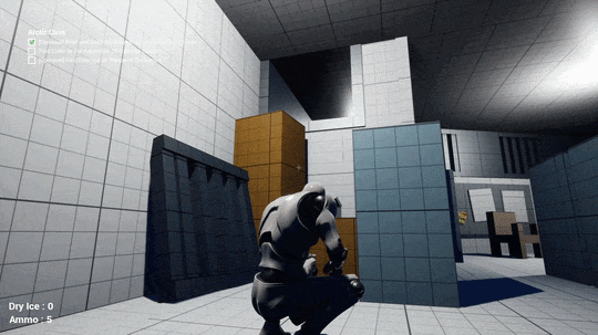
Phase 2: Playable blockout
When I moved into Unreal, I had to tighten the scope fast: shrink the footprint, reduce enemy count, and clean up areas that were cluttered or hard to read. This is where most of my playtesting occurred, where I would find that things that I thought were obvious to me were not communicated well to the player. Iteration became my friend as I would pump out new versions to playtest daily.
Walkthrough of the level from my phase 1 mission design document.
What changed and why
1) Exterior readability and guidance
Problem: the outside space felt too open, and objectives were easy to drift past.
Change: condensed building scale, added key in fountain objective, and used cables/leading lines to connect related interactions.
Result: players had stronger direction without losing freedom.
2) Theatre clarity and stealth options
Problem: the theatre space was cluttered and hard to parse.
Change: restructured to be less congested, improved sightlines/obstacles, added dry ice fog
Result: cleaner pathing, better scouting, and can learn the dry ice mechanic
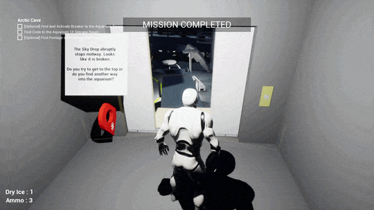
3) Better Sky Drop Payoff
Problem: riding the tower up was functional but not exciting.
Feedback: “Tower is boring for something so special looking.”
Change: turned it into a sequenced event where it breaks halfway, forcing a climb with a real traversal finish.
Result: the tower became a memorable story beat, not just an elevator


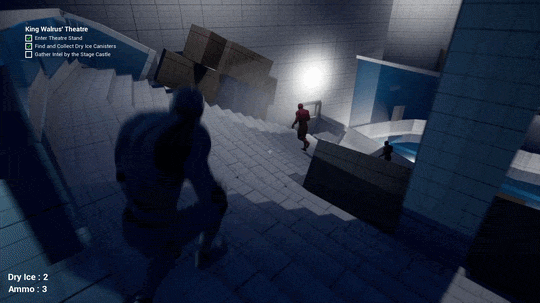
Sequenced event where the sky drop breaks down halfway up and the player must scale up the side of the burning ride
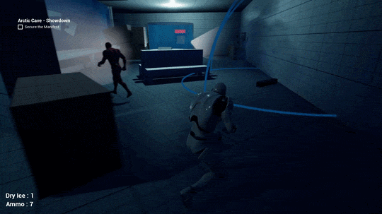
New Ingredient: Dry Ice Fog Canister
I added dry ice because I wanted a stealth tool that fit the location and solved a real problem in my layout: Arctic Cave had tight patrols and long sightlines, but not enough natural cover. Dry ice already exists as show fog in the park, so turning it into a throwable obscurant felt grounded, not “gamey.”
Design intent
Create temporary cover where there is none, so players can make their own lanes through cameras and patrols.
Keep it non-spammy: limited charges, short-lived effect, planning over brute force.
Teach, then test
Teach: Theatre Stand, a safer closed space with two enemies. I give two canisters: one “free try,” one for a deliberate plan through the encounter.
Test: Aquarium near the manifest, where players already understand the tool and can choose better deployments. Playtests showed the area was too spacious and the fog felt weak, so I moved it earlier and increased the radius, density, and duration.
Blueprint implementation
BP_DryIcePickup: mirrors the ammo pickup pattern, collects, hides mesh, updates UI.
BP_DryIceDeploy: spawns smoke, enables an overlap volume, and triggers AI response events. I also disable the collider when the item is “empty” so it cannot affect enemies.
AI reaction: when inside the fog, guards lose player tracking and sight range is effectively removed, then restored on exit.
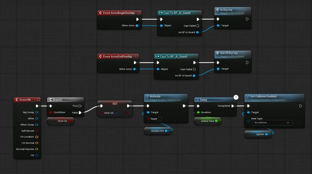
Blueprint of deploying dry ice for player
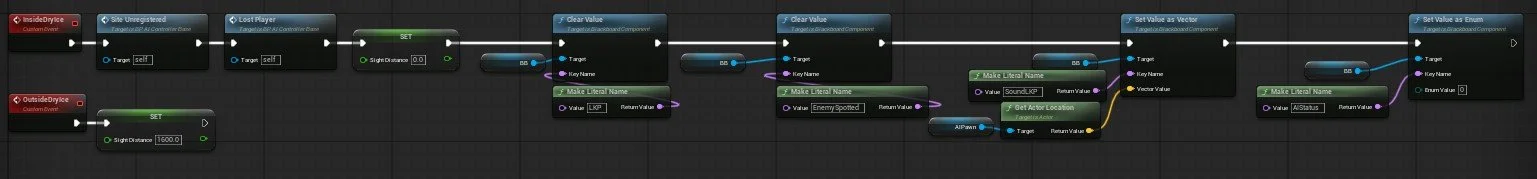
Blueprint of dry ice effect for enemies when entering collider
Playtesting
I ran structured playtests with specific questions around ammo balance, readability, enemy path clarity, objective confusion, and route choices.
My workflow:
Collect feedback
Sort into “can act on” vs “cannot act on”
Prioritize by effort vs impact
Patch, then retest
Playtesters had trouble following button connections. I used cables and leading lines to guide players.
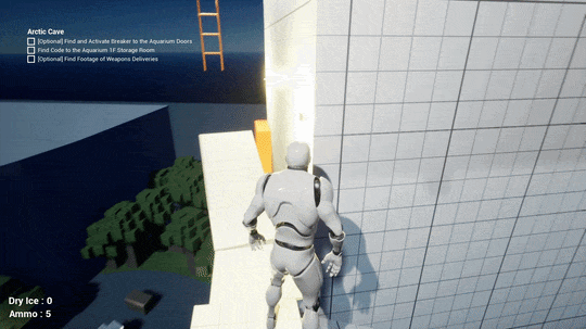
On the broken down sky drop roller coaster, players must make a far jump to the ladder to climb to the top.
Designing Multiple Routes
Entrance ladder to top roof
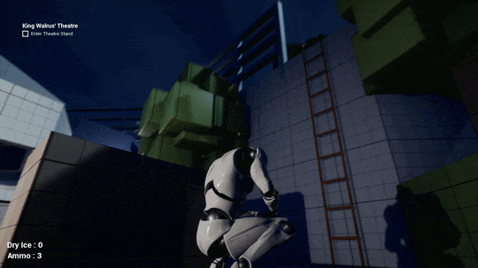
Castle roof in theatre
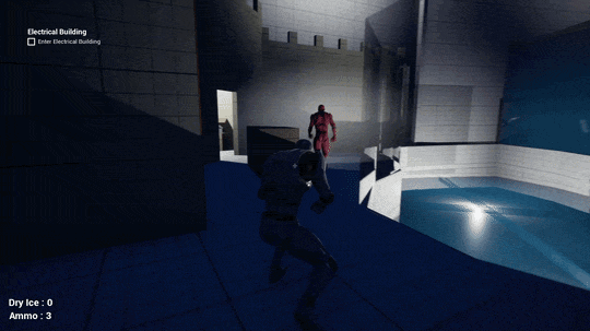
Sky Drop to truck
Vent side quest
What I learned
Constraints are not a limiter; they are a design tool. The AI cap and space limits forced me to cut “filler” and keep only meaningful guards and cameras.
Playtest early. Even if it is not fully done, get new eyes on sections as soon as possible to test readability and enjoyment.
Teaching a new mechanic (dry ice) needs a deliberate “teach → test → challenge” plan. I got close, but I would structure it even earlier next time.
A big landmark must earn its screen time. Turning the tower into a traversal sequence was the single highest-impact change.